

15 Dec Beer packaging takes inspiration from Pantone
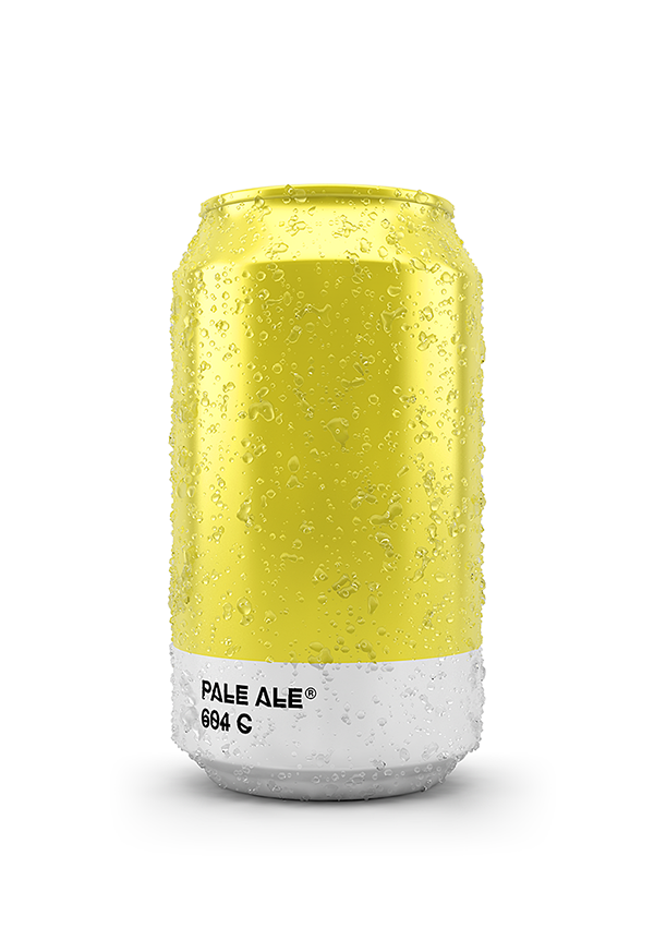
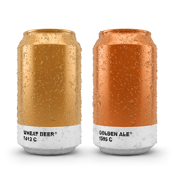
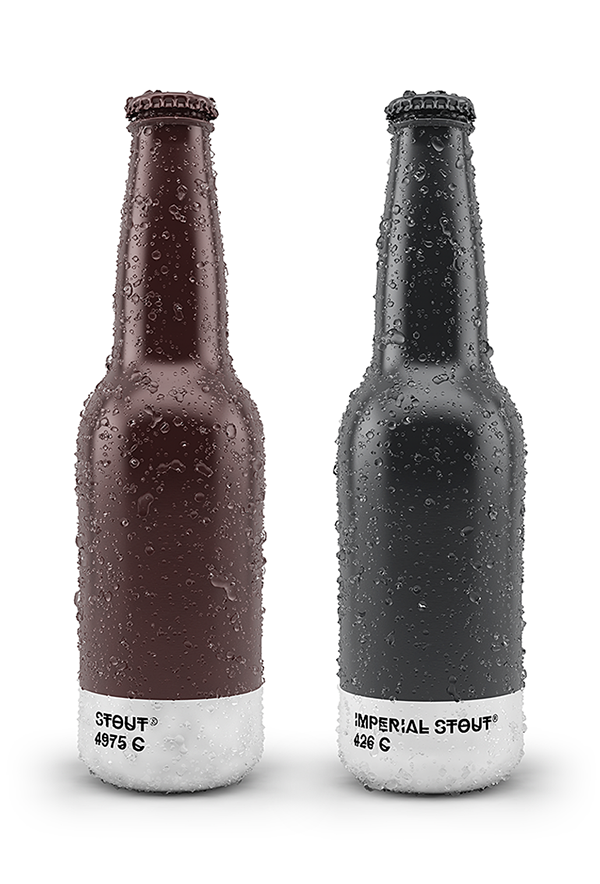
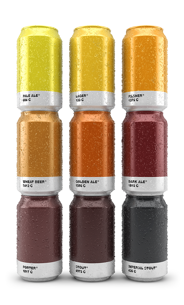
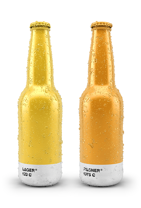
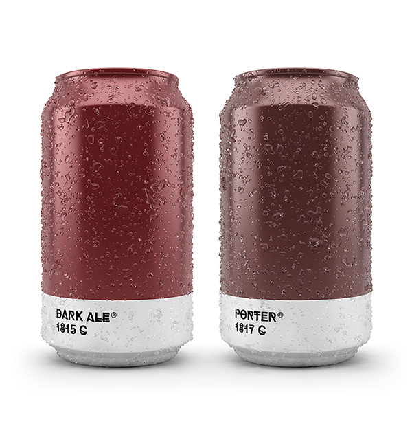
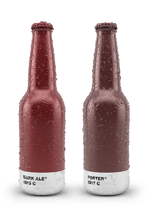
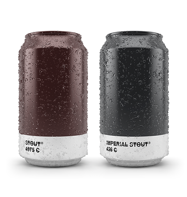
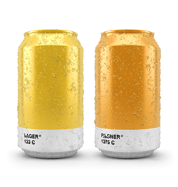
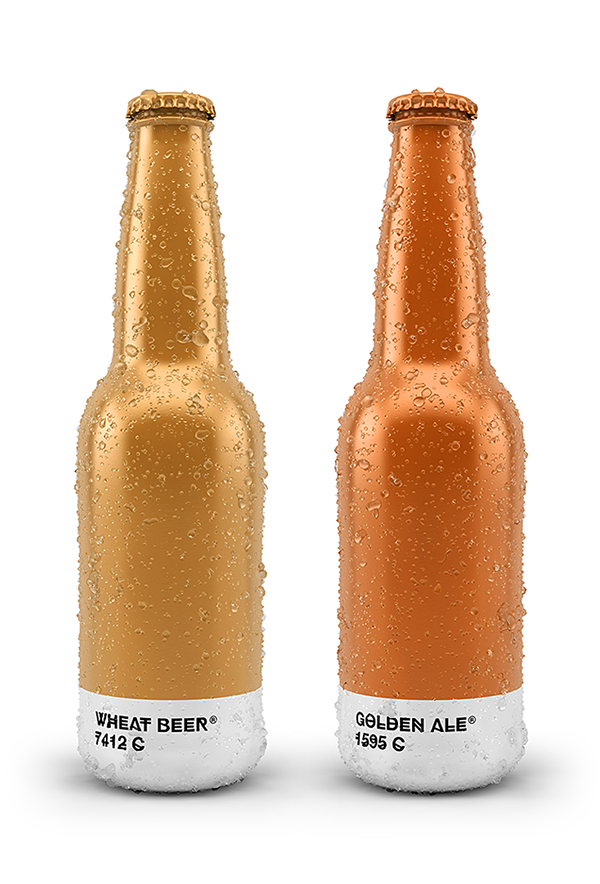
We at Revolucion love the packaging for these bottles and cans that match the color of the beer to its corresponding Pantone color.
The trend for home breweries and craft beers has led to an explosion of inventive and original beer label designs, with plenty of brilliant beer label design offerings in recent months. This latest project combines both packaging design with label design to bring you a Pantone-perfect collection of craft beers.
Created by Spanish creative agency Txaber, each type of beer is matched with its corresponding Pantone color. From Pale Ale to Imperial Stouts, there’s a Pantone color for every type of your favourite alcoholic tipple.
The typeface chosen is HipstelveticaFontFamily in its bold version, created by Spanish typographer José Gomes. The type is absolutely free to download, so if you’ve fallen in love with these designs as much as we have, you can start experimenting yourself.
What do you make of this beer packaging? Let us know in the comments box below!
No Comments